
# A Fresh Coat of Paint – The Pocket Alert Redesign

> We rebuilt Pocket Alert from the ground up — a brand-new design, a dark mode, and a pager we love even more. Here is the story, with a look back at where we started.

*12.06.2026*

<!-- source: https://pocketalert.app/blog/pocketalert-redesign -->

Three years ago we started Pocket Alert with one stubborn idea: alerts should feel like a pager going off in your pocket — instant, glanceable, impossible to miss. The product worked. The look, honestly, was starting to show its age.

So we did the thing every team puts off for too long. We redesigned everything.

**Where we started**

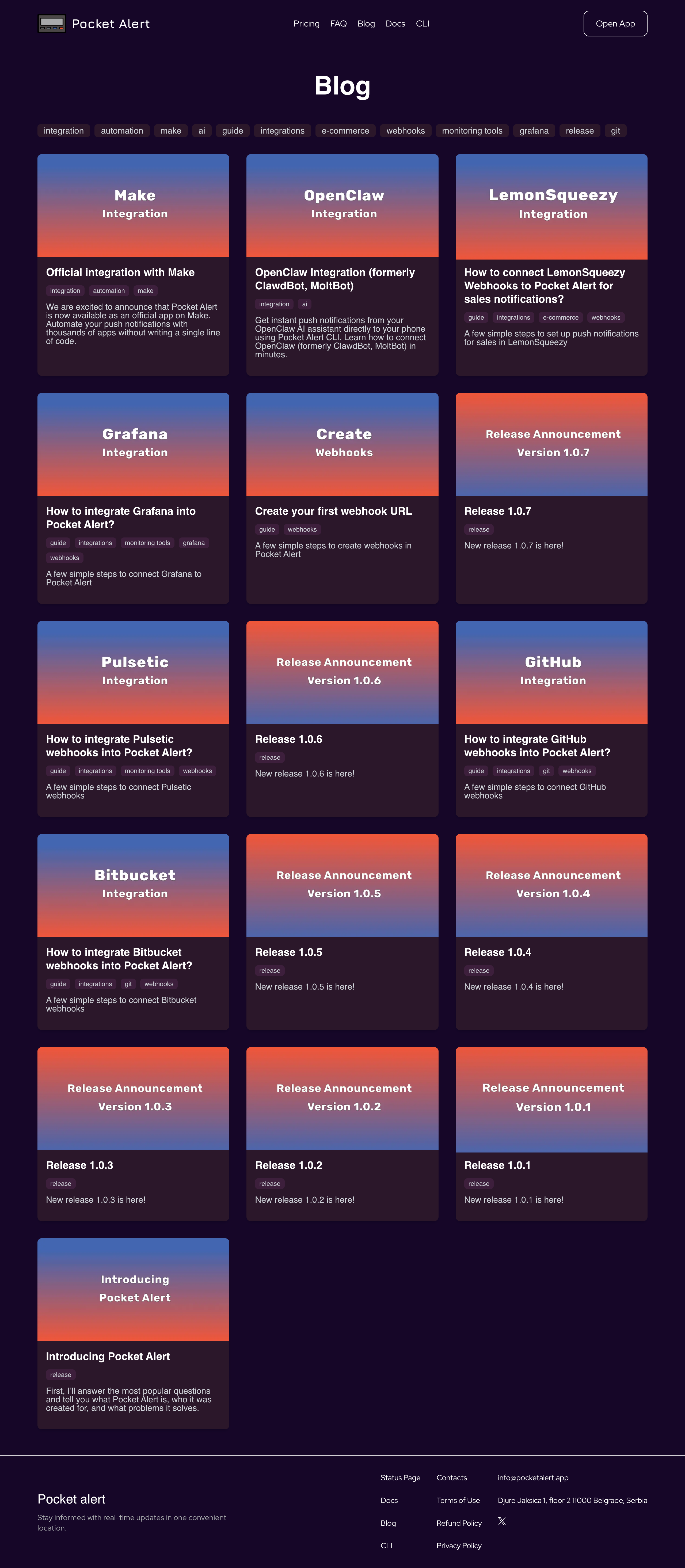
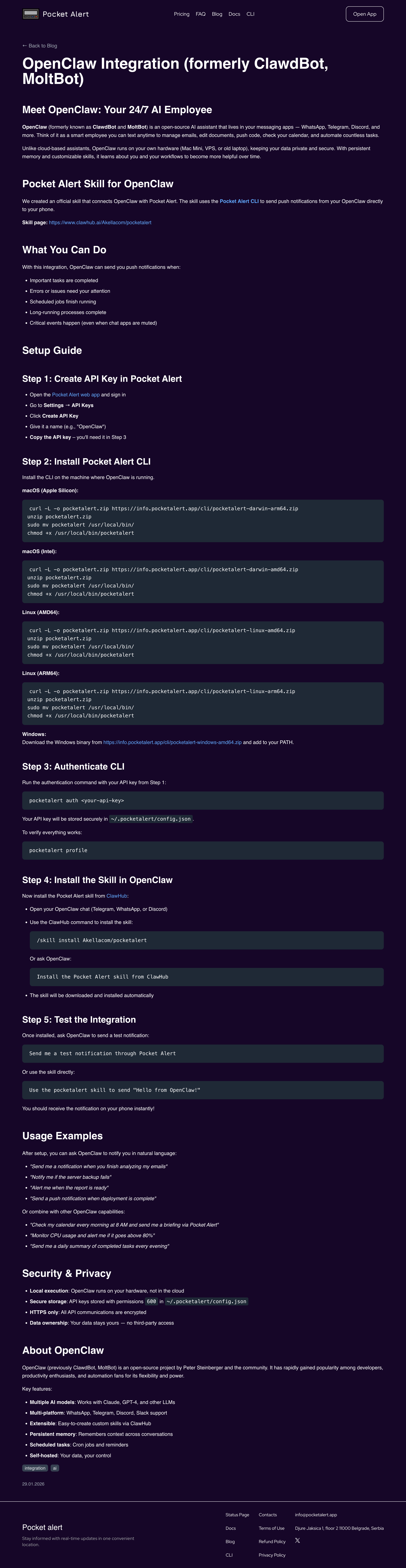
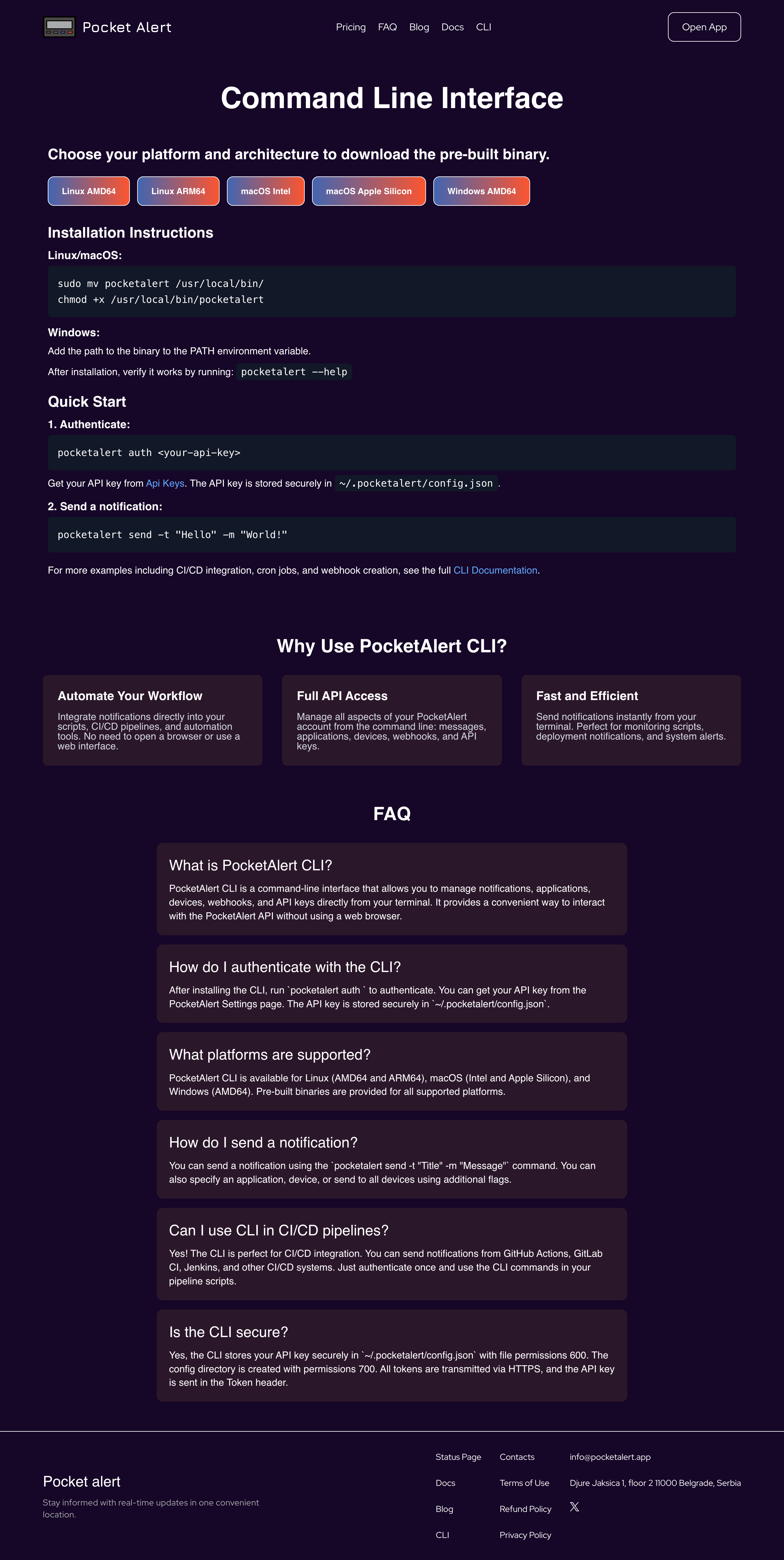
The first version of Pocket Alert did its job, but it grew one screen at a time without a shared design language. Buttons, spacing, and colors drifted apart. Here is what it actually looked like — tap any image to open it full size:

<div class="shots">
<a class="shot" href="https://cdn.pocketalert.app/blog/old-app-2026-06-12-15_51_41.png" target="_blank" rel="noreferrer"><img src="https://cdn.pocketalert.app/blog/old-app-2026-06-12-15_51_41.png" alt="The original Pocket Alert app dashboard" loading="lazy"></a>
<a class="shot" href="https://cdn.pocketalert.app/blog/old-app-blog-2026-06-12-15_52_25.png" target="_blank" rel="noreferrer"><img src="https://cdn.pocketalert.app/blog/old-app-blog-2026-06-12-15_52_25.png" alt="The old Pocket Alert blog" loading="lazy"></a>
<a class="shot" href="https://cdn.pocketalert.app/blog/old-app-blog-openclaw-skill-integration-2026-06-12-15_52_42.png" target="_blank" rel="noreferrer"><img src="https://cdn.pocketalert.app/blog/old-app-blog-openclaw-skill-integration-2026-06-12-15_52_42.png" alt="An old Pocket Alert blog post" loading="lazy"></a>
<a class="shot" href="https://cdn.pocketalert.app/blog/old-app-tools-cli-2026-06-12-15_53_02.png" target="_blank" rel="noreferrer"><img src="https://cdn.pocketalert.app/blog/old-app-tools-cli-2026-06-12-15_53_02.png" alt="The old Pocket Alert CLI tools page" loading="lazy"></a>
</div>

<p class="shot-cap">Pocket Alert, the way it looked for the last three years.</p>

It was functional. It just wasn't *us* anymore.

**What changed**

This isn't a tweak — it's a full rebuild of the interface. New typography with Geist, a warmer neutral palette anchored by a confident forest blue and a coral accent, and a single design-token system so every screen finally speaks the same language. Cleaner spacing, calmer surfaces, sharper focus on the content that matters: your messages.

The whole site moved together — landing page, blog, pricing, and your entire account area. Everything you see now comes from one source of truth, which means the next change ships faster and looks consistent everywhere.

**We kept the pager — and made it cooler**

The pager is Pocket Alert's soul, so it wasn't going anywhere. We just gave it a glow-up. It's still the little device that buzzes when something needs you — now rendered with more character, living right on the homepage as a playable demo. Same idea, more personality.

**Say hello to dark mode**

The most-requested feature is finally here. Dark mode runs across the landing page *and* your account, with a toggle in the header that remembers your choice and respects your system preference on first visit. No flash, no jarring white screen at 2 a.m. when a real alert comes in — just a calm, readable interface in any light.

**What's next**

The web is only half the story. The mobile app is what lives in your pocket — and it's what we're actively working on right now. The new design language, the refreshed pager, and dark mode are all on their way to iOS and Android. It's a work in progress, but it's coming, and we can't wait to put it in your hands.

This redesign isn't a finish line; it's the new foundation. Thanks for being here for it — the best parts are still ahead.

**Try it now:**

- [Download for iOS](https://apps.apple.com/app/id6446805143)
- [Get it on Google Play](https://play.google.com/store/apps/details?id=com.pocketalert.app)
